Logo Designs
This is a gallery of several of our logo designs so you can see if our styles can match your vision.
Click on pictures to see the logo larger.
Designed Original
This was created in design school by the owner of Designed Co. He has created all of the iterations of our designs, actually. This particular design came to him when he saw a photo of a person in profile. As he looked at the eye shape of the pupil, iris and eyeball, he thought it a good symbol of a forward-thinking and looking firm.
Finally, after drawing the eye form, he examined the different typography he could use and chose a more whimsical and fun typeset. After he paired the type with the icon, he realized there needed to be more flow in the icon and so worked to stylize it and the dot on the “i” in the word “Designed”, thus tying in the two pieces.
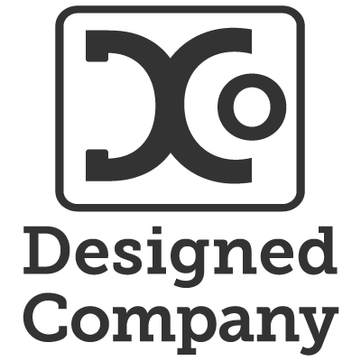
Designed Co.
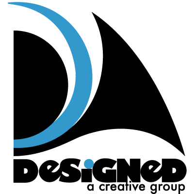
After school, Ben went and worked for several different companies. Many of these he designed assets for. Brochures, booklets, and logos of course. In time he found himself on his own and needed to start his own company. At that time he created a design house out of his house. He called it Designed Co since his original name’s domain was taken.
After several revisions, this final design was selected. The stylized combined “D” and “C” were aesthetically pleasing being fairly balanced, while the “o” said who it was and also hearkened to the eye symbol in his original design. This logo was designed as a single color logo so that it could be put in any color needed, though we primarily displayed it in dark grey and a shade of blue. The font is Museo Slab, giving weight and power to the design.
Designed Co. Now
For the last couple of years we’ve been diversifying our skills. We’ve been learning and providing SEO, local marketing, Google Ads and so much more. Recently, Ben decided that the company would be split. Our sister company, the Credoo Company, handles web design, local marketing and other interests and Designed Co. came back to its roots: graphic design with an emphasis on logo design.
This logo was designed after seeing an architect’s compass draw a circle. Since the design agency was “coming full circle” and could “encompass all of graphic design” it seemed appropriate to our new mission. We went back to a lower-case geometric sans-serif font called Avenir. It’s clean lines and pleasing shape make it an approachable font while suggesting a willingness to bend the rules to provide the best service possible. The yellow color is warm and inviting, the grey is sophisticated and certain. While the white alternate shows a clean aesthetic and looks great on dark backgrounds.
