About Logo Design

Designed Co. has been designing logos for years. Here’s a little info about us.

Designed Co. History

Once upon a time Ben went to design school and fell in love with everything graphic design related. While in school he took a course all about logo designing. Although the actual designs were fun to see and create, it was the theory behind some of the most memorable logo designs on the planet that captivated his attention.

Fast forward a few years and he was designing all sorts of logos for everyone from a lawn mowing company to an elite note investing firm. That’s when he determined to create Designed Company as a stand alone firm developed around the idea of creating branding for all sorts of companies.

We develop logos according to your needs, your customers’ and our aesthetic. Since we create myriad logos in vastly different styles, we’ll get your logo done right.

Contact Designed Co.

Send Us A Message

    Designed Co. Through The Years

    The Original: 2009-2012

    This was the original logo designed by Ben Towers in school for his “future design company business.” Although the idea behind what the business would be, the ideas in this logo are still true to the vision. Indeed, vision is what this logo is about as it was based on what an eye looks like from the side as it was looking forward.

    Development: 2013-2017

    As Designed Co. was growing to encompass everything design-wise from logos to brochures to website design, the logo was reimagined to be a bolder and more modern style. The only reason we let it go is that it is similar to another top brand’s logo. Even though it wasn’t designed after that, we deemed it too close for comfort and changed it to the current logo.

    A Mature Company: 2018

    As our company is now “mature” (even though we may not be) we thought it time to come “full circle” and re-create our brand as a logo design company. Elements of the design include a Compass: indicates craftsmanship & exactness in execution; Circle: wholeness, complete; Font: Avenir, modern sans serif shows youth energy; Lower Case Lettering: laid-back, modern.

    Primary colors are a Dark Grey: elegant, modern and strong, but softer and more accessible than black; and Dark Yellow: bold, risk-taking, happy!

    Different Logo Design Styles

    With so many logo styles out there how can you decide which way to go? Well, here are the styles we’ll look at for your brand.

    Typographic: "Wordmark"

    37% of the worlds top 100 brands use only text in their logo. Basically, these—and millions of other businesses—use a stylized version of their names. Usually called “wordmarks” or sometimes “logotypes” they perform best with very distinctive company names such as Google, Yahoo!, & Facebook.

    Typographic: "Lettermark"

    When you design a logo, simplicity is generally the goal. The simpler a logo, the more memorable it is and lettermarks are about as simple as they can be.

    This can be useful if your business’s name is difficult to pronounce or particularly long. Consider how concise, meaningful and memorable “IBM” is rather than “International Business Machines.”

    Abstract Symbol or Icon

    Sometimes an image is more effective at sharing information with an audience. These pictograms are able to give your audience a clear idea of what your company is or represents. Also called brandmarks, these logos are considered archetypal when a company becomes a name so well know they need no introduction. Think of the logos for Nike, Target or Apple.

    Combination Marks: Text & Symbol

    Over half of the top brand logos incorporate both text and an abstract symbol. Known as combination marks, or, more rarely, iconic logotypes, these logos attempt to be the best of both worlds, so to speak. Their popularity stems from writing out the name of your company and also associating it with an image.

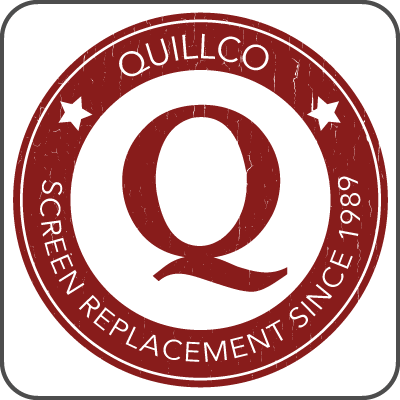
    Emblematic: Logos In Another Design

    Emblematic logos involve putting text inside a symbol rather than next to it as in a combination mark. This creates an iconic design that makes the typography nigh inseparable from the emblem. Imagine seeing the Ford text without the blue oval. Kind of strange, right?

    Emblematic logos tend to look more like a seal or badge and are probably the third most popular logo after combinations and words.

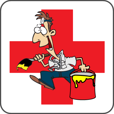
    Illustrated Mascot Logos

    Great for establishing a brand and a spokesperson at the same time, mascot branding also speaks well to all sorts of demographics. These types of logos are found everywhere with some of the top brands you know like Michelin, KFC and more.

    Meet The Owner

    Benjamin Towers

    Benjamin Towers

    Founder & CEO

    Ben went to school for graphic design graduating at the top of his class from Stevens-Henager College in 2010. He also attended the University of Utah and Western Governor’s University studying business management.

    With many years of marketing experience, he is keen on understanding how people identify with brands and has spent the last 10 years developing his skills toward graphic branding.

    On a personal note, he spends all his spare time with his family, outdoors hiking the Georgia woods or removing the ticks that fall like rain in those woods!

    Let's Work Together!

    We can’t wait to work with you for your branding needs. You can always give us a call or you can send us an email by clicking on the button below. Either way, we’ll talk soon and get this project started!
    designed-co-white-square-logo

    Location

    395 E Paris Dr
    St. George, UT

    (435) 244-2550

    [email protected]