The Solargreen Modern Logo Project
About this Project
Solargreen was an idea whose time had come: sell solar panels to the masses because they were finally getting to a price point that was at or near parity with large-scale power generation. “Power to the People!” was the idea.
When Designed looked at the things needed to make this logo work, we needed to look at colors as well as typography. A good rule of thumb when designing a logo is to make the logo work in black and white first. If it does,, then you probably have a decent logo on hand and can start working on the colors.
We had a good logo! We knew that the universal power sign, stylized a little bit, would be immediately recognizable. Make it glowing with power and it is more striking. Add green to the remainder of the word in a simple font and you can definitely get the point across.
Project Details
Client Solargreen, LLC
Project Logo design, business card design
Date February 2011
Logo Style Combined logotype
Font Opificio
Location Salt Lake City, UT

White Painted Cabinets
We chose to paint their main cabinets in a beautiful white that would form the background color of the kitchen. Mr Cabinet Painter also updated the hardware to an modern rubbed bronze handle.
More Logo Designs From Designed Co.

Happe Reid Law Logo
Happe Reid wanted an update evoking power, prestige & approachability.

Nest Pest Control Logo
Nest Pest Control needed something that got the point across clearly, but in a modern style.

Stacy’s Coffee Logo
Stacy’s Coffee Shop wanted to create their own brand of drinks.

Southern Classic Logo
Southern Classic needed something aggressive but not threatening; exciting but not crazy.
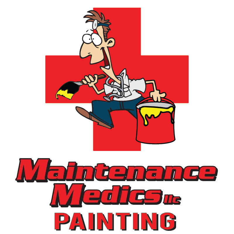
Maintenance Medics Painting Logo
Maintenance Medics was opening a new side of their business and needed a tweak to the character.

Quillco Logo
Quillco never had a logo, but their company feels stately and classic.
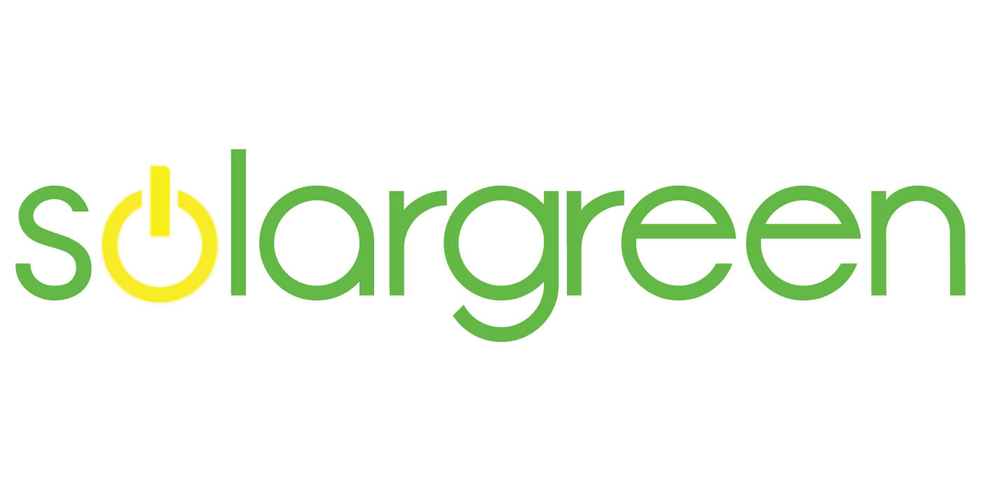
Solargreen LLC Logo
Power for the People.
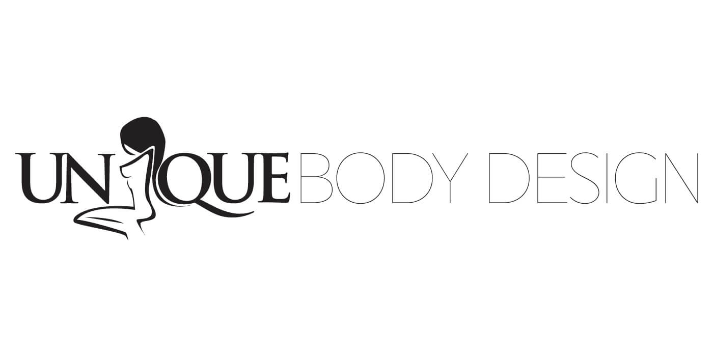
Unique Body Logo
This group sculpts bodies into shape via health, beauty and wellbeing products.

ITS Logo
ITS Team is a technology management firm in San Diego needing an ongoing simple but memorable logo.

Natural 411 Logo
Natural, holistic health and wellbeing are the forté of this logo.
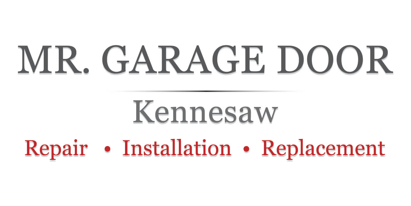
Mr. Garage Door Logo
Jayme, the owner, is no-nonsense and needed a logo to reflect that.

MaxROI Media Logo
Max ROI Media creates publications on how to increase investment wealth. Power, energy and avant-garde thinking.
Columbia Clean Logo
Columbia Clean was a transplant power washing company that needed to help its customers know it was home.
HCG Construction Logo
Hernando came to me needing a logo and business card.

NIS Logo
The Note Investor Summit needed to make sure people knew they were getting a “wealth” of information.

Peak Capital Media Logo
Media services to those in the capital financing space.
Uplfting Logo
Zahi is all about making another person’s day in Edmonton.

True Choice Logo
Giving folks a new way to select and finance vehicles is True Choice’s mission.
CJ Service Logo
Colby fixes appliances among other machines around Tulsa.

Jewkes Law Logo
A contemporary yet classically-based law firm was the feeling Jewkes was after.

Mad Chad Logo
We cut grass. This logo isn’t for every situation, but is powerful when used right.

Mr. Cabinet Painter Logo
Mr. Painter wanted to focus on cabinets and needed to let people know he does a great job. Classic, bespoke and approachable.
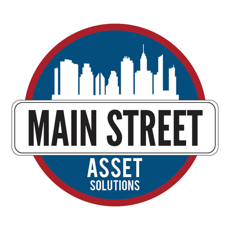
Main Street Asset Solutions Logo
Your every-day financial partner for note investments, Main Street had us create a couple of logos for their brand.

Jones Logo
Brent wanted shiny and bubbly. I steered him toward this bold and very Florida design. He loved it!
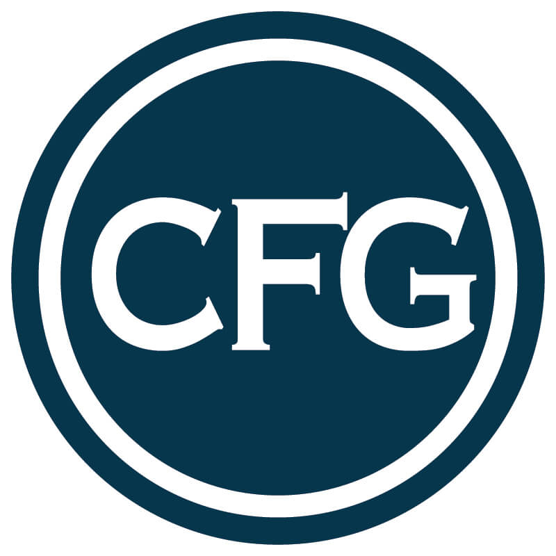
CFG Logo
Capital Funding Group just needed a facelift to their great emblem logo.

RFN Logo
Ramona Family Naturals needed a logo for a menu we were designing and their previous one was best for their storefront.
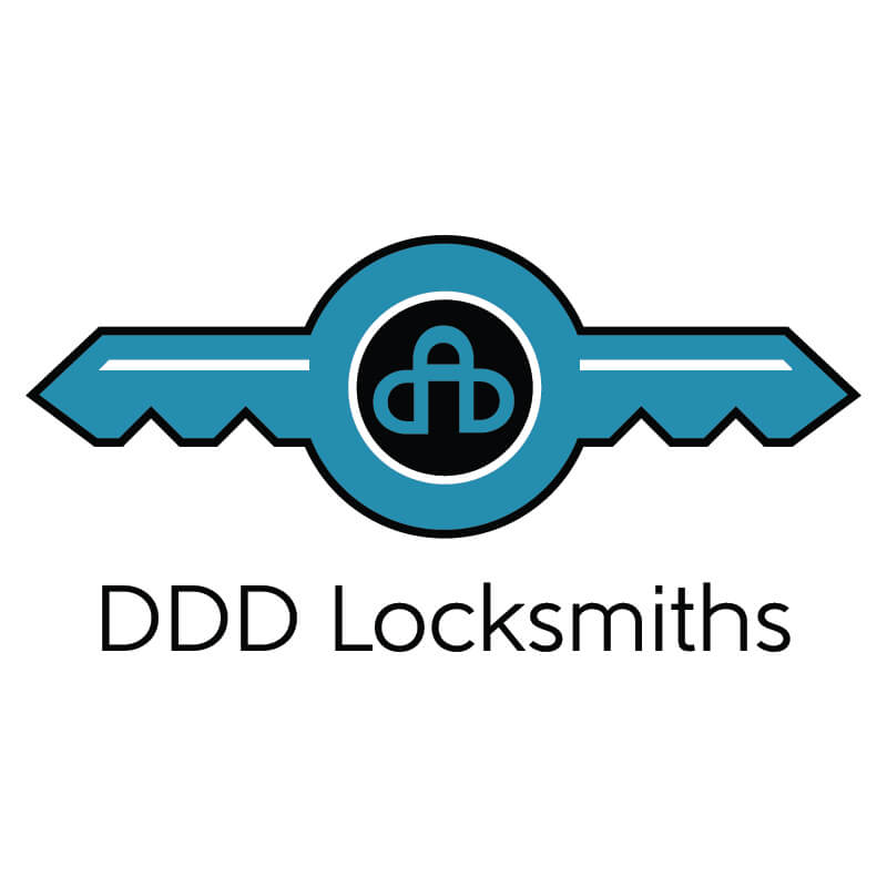
DDD Logo
Dennis needed something noteworthy and trustworthy.

Taste of Ramona
Ramona City was putting a festival on and the colors of the Western deserts were a natural fit.
Recent Comments